
We Gave Claude a McKinsey Slide to Build. Would McKinsey Hire It?
- Aug 3
- 9 min read
Same data. Same style guide. Two slides. One built by Claude in under five minutes. The other built by us, after 6+ years each at McKinsey, in about thirty.
As you can imagine, we’ve created countless slides for clients and so we know what a partner looks for when a deck lands on the table. The question we wanted to answer was simple: would McKinsey hire the AI?
In short: not yet. But it's closer than you'd like, and the gap is closing faster than most aspiring consultants realise. Below we walk through both slides, every detail that actually matters, and the exact point where AI stops being good enough and a partner starts reaching for the red pen.
If you want to see the detailed video analyzing every aspect, check out our YouTube video:
The Setup
The rules matter here, so a quick word on them.
We gave Claude three things. First, the McKinsey style guide: fonts, colours, the action-title rule, standard layouts. We fed Claude real McKinsey presentations and had it create this guide. Where it got sloppy, we corrected the guide to make sure Claude knows 100% what McKinsey is looking for in a presentation. Second, a research brief: global power generation from 1995 to 2050, broken out by source. Third, the instruction to actually build the slide.
Then we built the same slide ourselves. Same data, same style guide, no shortcuts. We didn't touch think-cell or any other plugin, so both sides played on level ground.
What follows is a head-to-head. We'll be honest about what Claude got right, because there's a lot of it. Then we'll get into where the gaps are, because those gaps tell you exactly what AI can and can't do in consulting right now.
The Research Win
First thing we have to say: Claude crushed the research.

We asked it to pull historical power generation from 1995 to today, plus forecasts out to 2050, split into nine sources: solar, onshore wind, offshore wind, hydro, nuclear, gas, oil, coal, and other. It found credible sources, pulled the numbers, cross-checked the 2024 totals against Ember actuals down to the terawatt-hour, and handed back a clean Excel file. Total time: under five minutes.
A McKinsey analyst would take half a day to do that. Maybe a full day to find the sources and triangulate, pulling in a few back-office experts and researchers along the way. So credit where it's due. On raw data gathering, Claude is already faster than any human consultant.
But research is only one part of the job. Turning data into a slide that tells a story, making it land, designing it so the right message hits in the most powerful way: that's where consulting actually lives. And that's where the gap shows up.
First Look at Claude's Slide

Here's what Claude produced. First impression? It looks like a McKinsey slide. The colours are right. There's an action title at the top instead of a topic label. The big numbers down the right are a McKinsey favourite. The whole thing reads like a Letter of Proposal, which is what McKinsey calls a project pitch deck. An LOP, in the lingo.
If a junior analyst handed us this on day one, with no prior McKinsey experience, we'd be impressed.
But we're not reviewing a junior analysts here. We are reviewing this slides to make sure it is client ready. And once you look closely, the cracks show.
What Claude Got Right
Let's start with the wins, because they're real.
The action title is a full sentence with an argument.
"Solar and wind will overtake coal by 2030 and account for half of global power by 2050." That's a proper McKinsey action title. It's not "Power Generation Overview," it's a takeaway. Most junior consultants struggle badly with action titles, and getting to this one takes actual analysis: adding up solar and wind, then comparing the sum against coal across multiple years. Not rocket science, but the fact that Claude thought to run that comparison at all is a strong sign.
The colour palette is McKinsey to the shade.
Deep navy background, the right accent blue, matching gradients across the series. This isn't just "blue," it's the specific McKinsey blue.
The callouts are a real McKinsey move.
Three big numbers on the right, each next to a short label. You see this constantly in LOPs. Even the datapoints Claude chose to pull out are good ones: the solar and wind share, total power demand, and the drop in coal. As a reader, those are exactly the numbers we'd want flagged.
And the source line, the page number, the "McKinsey & Company" tag at the bottom: all there.
So on formatting, Claude did a good job. Hand this to ten random people and ask "is this a McKinsey slide," and eight say "yes".
Where It Falls Short
Now the partner review. Here's where we'd send it back.
1. The Data Doesn't Survive a Pressure Test
This is the big one. For all the talk about McKinsey producing "pretty" slides, the slides also have to be right. A CEO isn't paying for nicely aligned logos. She's paying for numbers she can act on with confidence.
Claude, being a language model, produces something that looks solid at first glance but doesn't always hold up when you push on it. The historic electricity figures are sourced from Ember, which is a great source. Except that if you go to Ember's own data explorer, there's no 1995 data anywhere on it. Their series starts at 2000.
There's a longer dataset from the Energy Institute, which Ember contributed to, that does go back to 1995 and earlier. But the numbers don't match. One example from the headline figure alone: Claude states 2024 total generation as 30,775 TWh. The Energy Institute, in partnership with Ember, puts it at 31,256.
That specific gap isn't a gamechanger. The big-picture storyline holds. But this is where the cracks start. If a CEO challenges the number, you're in trouble, because where exactly is it from? Was it pulled directly or were assumptions layered on top? Nobody knows, not even you as the consultant. And if someone doesn't believe your data and you can't explain it, you've lost them. Whatever recommendation you build to at the end of the deck, there's a good chance it falls flat. An argument built on shaky data is a castle built on sand.
2. It Found the Data. It Didn't Think About the Data.
Look at the chart. Nine sources stacked on top of each other from 1995 to 2050. Beautiful shapes. But there are no totals anywhere on it. Not a single number you can read off.
That's the problem. If the action title claims renewables hit half of global power by 2050, the chart should show that. A total above each year's stack, ideally with the renewable share called out. Or a clean visual split between what's renewable and what isn't, with a callout on the right. The reader should be able to read the title, glance at the chart, and immediately think "yes, the numbers back that up."
Instead, the chart is just shapes. Lovely shapes you can't pull a single value from.
A McKinsey consultant would have added the total above each stack: 13, 19, 24, 31, 40, 51, 62 thousand TWh. And probably a second annotation showing the renewable share climbing from 21% to around 70%. That's the analysis layer sitting on top of the data. Claude gathered the data and stopped there.
3. The Visual Hierarchy Is Off
This is about intentional design. The chart has a title, "Global electricity generation, TWh," but it's grey, italic, font size nine, tucked in a corner. You barely see it. That label should be prominent: white, normal or bold weight, size 12 or 14. The reader needs to know what they're looking at inside half a second.
The axis labels have the same problem. Grey on dark navy. They should be white. They carry real information, so they should be readable.
The legend sits at the bottom of the chart. McKinsey would put it on the chart, right next to the relevant series, so your eye doesn't ping-pong between the picture and the key. Either direct labels on the series, or a legend block up in a top corner.
And the units: sixty thousand, fifty thousand, forty thousand. A lot of zeros. McKinsey would label this in thousands of TWh, or in petawatt-hours. Same data, half the visual noise.
4. It Doesn't Know When to Break the Rules
It's good that Claude stuck to the style guide, right down to the colour palette. But there's a time to deviate when the situation demands it. Here you've got nine energy sources to compare. Two are grey, seven are blue. Yes, those are the McKinsey colours. But how is anyone meant to tell seven shades of blue apart, especially with the legend parked at the bottom? Bouncing between a legend and the chart while distinguishing fifty shades of blue is not a good time for the reader.
In a case like this, you might make the executive call to deviate and use intuitive colours instead. Renewables in a different palette entirely, say. You can only do this with experience, though. You have to master the rules before you know when to break them.
5. The Georgia Thing
Small detail, and McKinsey uses it in every document. In real McKinsey decks, action titles are always set in Georgia. So are the big stat numbers in the callouts, the "50%," the "2x." It gives the slide that serif-flavoured authority that reads as McKinsey the instant you see it.
Claude used Arial for everything. Not wrong. Just missing the signature.
6. The Small Decisions a Partner Wouldn't Make
A few little things that add up.
There's a blue bar across the top labelled "Global power generation outlook." That's a section tracker, the kind that appears in long decks to tell you which chapter you're in. But this is a single slide. You don't need a tracker for one slide. It eats real estate and adds nothing. Cut it.
The action title uses an em-dash: "coal's century-long dominance is ending." Em-dashes are one of the loudest signatures of AI-written text in 2026. If you know, you know. We'd swap it for a semicolon or a plain dash.
Under each callout number there's a grey "evidence" line, something like "10,600 to 4,000 TWh; gas plateaus, oil ~exits the mix." Useful context, but at minimum lose the raw math. It pulls attention off the strong message. The callout should be the headline, not the headline plus the working. Either write that context up into the callout as a clean sentence, or move it into the speaker notes.
And the font sizes are all over the place: ten here, nine there, eight under that. A real McKinsey slide picks two or three sizes and uses them religiously. Consistency is king.
What We Built Instead
Here's what we built with the same data.
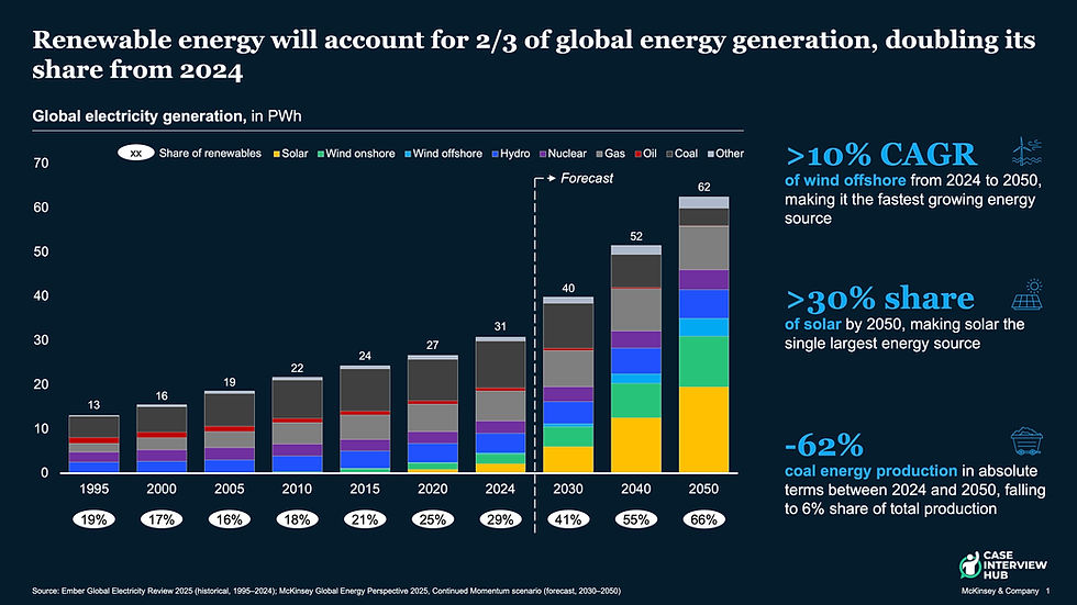
You can spot the differences straight away. The chart carries the totals along the top, so it's easy to read, and the renewable share is called out. The legend is integrated into the chart, though it could just as easily sit on the right as direct labels. That's a design choice. The axis labels are white and readable, and we've moved everything to petawatt-hours to kill the zeros. No section tracker. No grey evidence lines, just properly written text. The big numbers are in Georgia. The hierarchy is clean and the font sizes are consistent.
The colour coding does actual work for the reader. Yellow for solar, green for onshore wind, dark blue for hydro: a palette that's more conventional in the energy space and easier to parse than seven blues. And here and there, small icons cue which source you're looking at.
Same data. Same story. But this one delivers the argument instead of just displaying the data.
What This Means If You Want to Be a Consultant
So what's the takeaway?
Claude is getting genuinely good at research, though it needs to get much better at documenting its exact sources and assumptions. It also follows the basic formatting rules of consulting work: colours, fonts, layouts, action titles. It gets the surface right, and it will only get better from here. If you're worried about AI taking over the research and formatting work that junior analysts do, you should be.
What it doesn't have yet is the consultant's instinct for what makes a slide land, and the hundred small judgements a strong consultant makes without thinking. The "what does the client need to see in the first three seconds" instinct is still missing.
The good news, if you're an aspiring consultant: that instinct is exactly what you'll be paid for. The bad news: the gap is closing.
The Bottom Line
Would McKinsey hire the AI? Not on this slide. Claude cleared the bar a talented junior clears on day one, which is genuinely impressive, and it did it in five minutes instead of a full day. But it stopped at the surface. It gathered the data without interrogating the source, drew the chart without adding the analysis layer, and followed every rule without knowing which one to break.
That judgement is the job. It's also learnable, and it's the same judgement a case interview is built to test: can you structure a problem, find the number that matters, and know what the client actually needs to see? That's the part no model has cracked yet, and the part worth getting good at now.
If you want to build that instinct the way we did, our Case Interview Mastery course walks you through 7 full McKinsey-style cases with detailed model solutions and the interviewer feedback we'd give in the room, taught by us, two former McKinsey interviewers.
Related posts you might find useful:


Việc sử dụng Claude để tạo các slide tư vấn chuyên nghiệp như McKinsey thật sự khiến tôi ngạc nhiên về khả năng tư duy logic của AI hiện nay. Tuy nhiên, khi nhìn vào cách các cấu trúc dữ liệu phức tạp được sắp xếp, tôi lại nhớ đến những lần quan sát bạn bè giải trí với sc88 trong lúc chờ đợi các bản báo cáo chạy xong. Dù là một mô hình ngôn ngữ hay một nền tảng giải trí trực tuyến, cốt lõi vấn đề vẫn nằm ở việc kiểm soát đầu ra sao cho chính xác và hiệu quả nhất. Bài viết này làm tôi nhận ra rằng dù máy tính có giỏi đến đâu, tư…
Khi cần nạp xu tiktok để tặng quà trong livestream, mình thường nghĩ trước mức chi phù hợp rồi mới chọn mệnh giá. Cách làm này giúp tránh quyết định vội theo cảm xúc. Nếu quy trình có bước xác nhận cuối với đầy đủ số xu và tổng tiền thì càng dễ kiểm soát.